rebrand roll out on wordpress
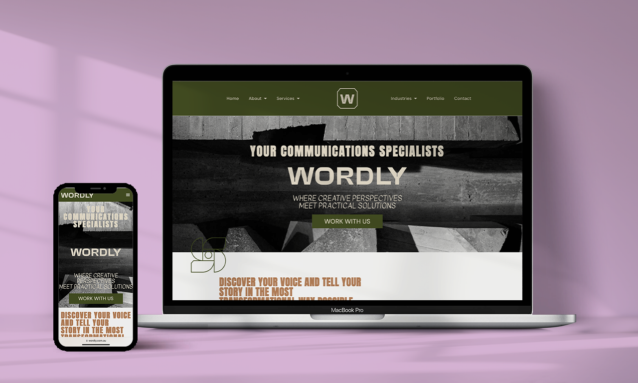
Wordly
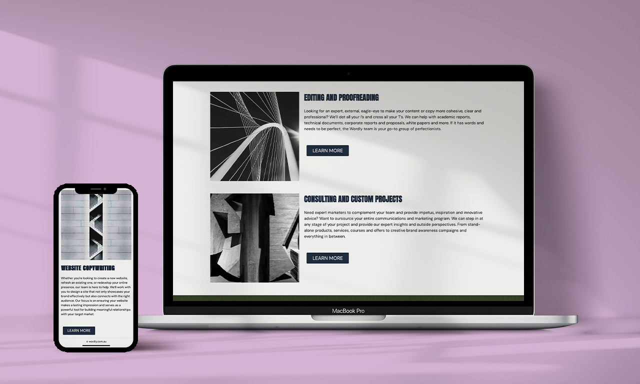
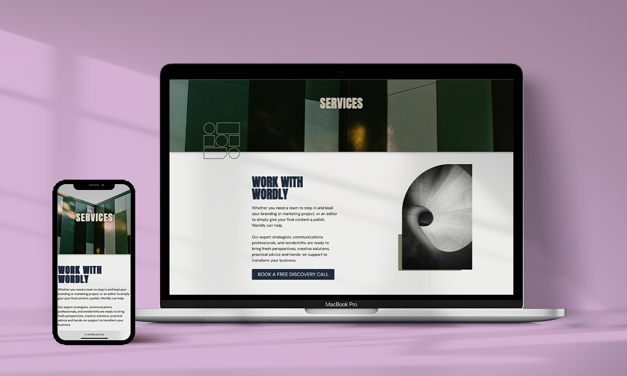
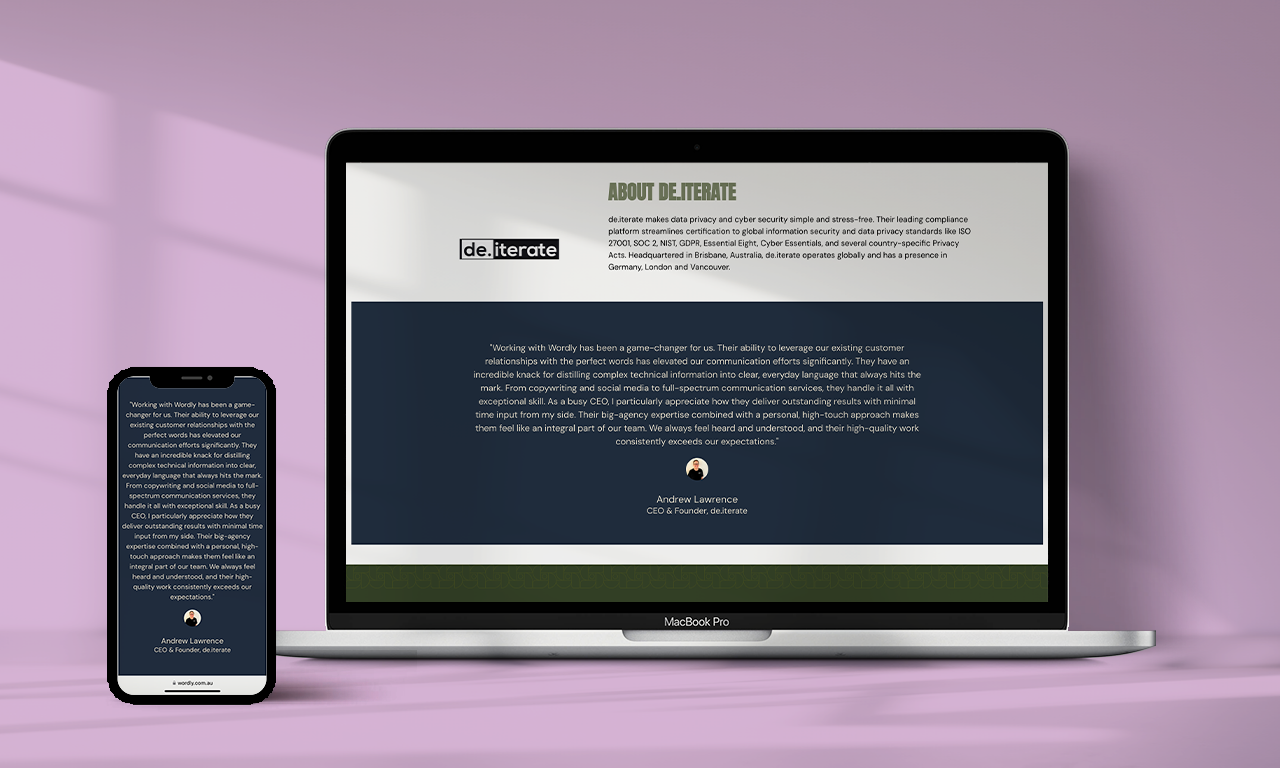
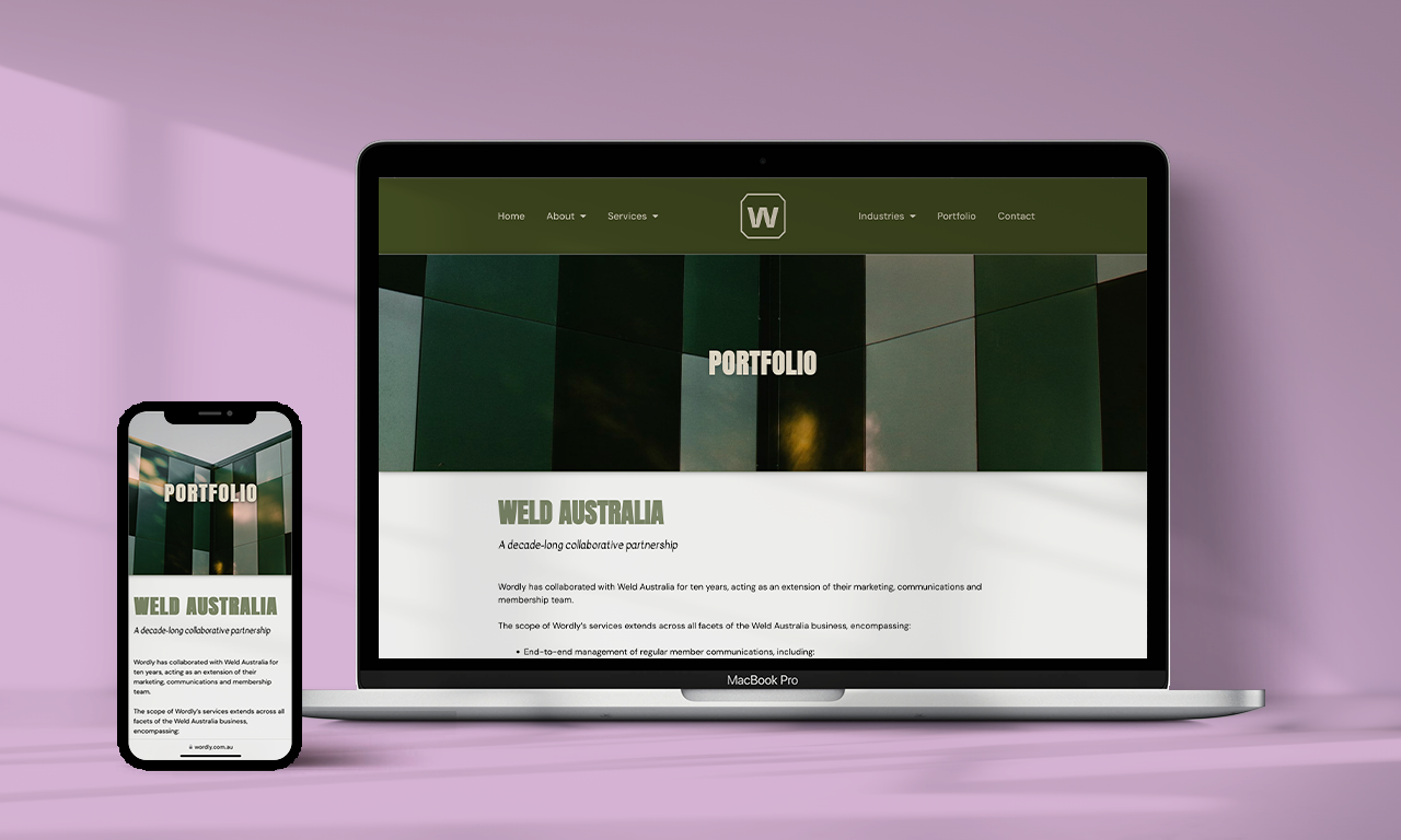
The challenge began with a fresh brand identity and the ambitious task of translating a single homepage concept across an entire WordPress ecosystem. Every internal page required bespoke architectural design to ensure the new visual language remained cohesive while scaling.
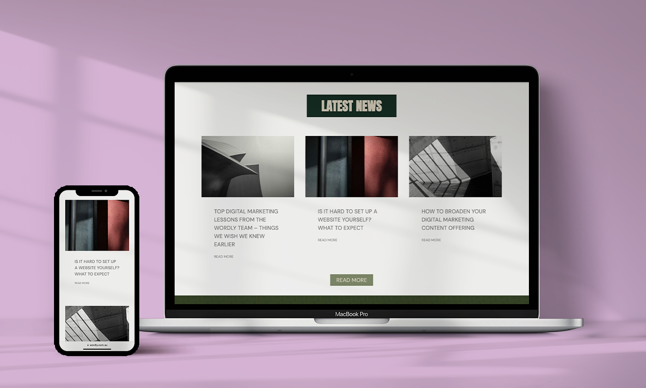
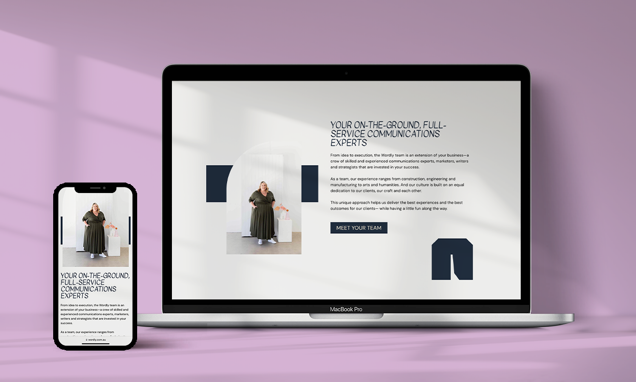
By leaning into an industrial aesthetic, the geometric motifs and dynamic motion elements that came from the home page, we were able to transform a static brand into a fluid digital experience. These "moving parts" serve a dual purpose: they capture user attention and reinforce the tactile nature of the brand’s new identity.
Success on this project was fueled by a seamless partnership with Sally from Wordly, whose precise copy provided the structural foundation for the layout. My role was to bridge the gap between her narrative and the technical constraints of WordPress, ensuring the final product wasn't just a container for information, but a high-performing brand asset. The end result is a sophisticated, fully-branded digital presence that balances raw industrial grit with polished, modern functionality.
What I did
Designed page layout
Roll out the rebrand to the website
Treat and curate images
Optimise SEO